Working with Geometries

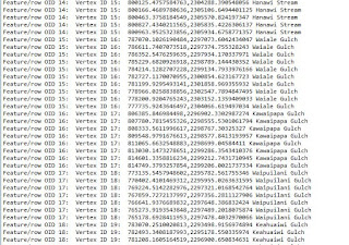
 This week I learned about working with geometries in Arcpy; how to read, write, and work with multipart features. We began by setting our workspace and utilizing a cursor in order to create a new txt file, and write data into it from the rivers.shp. Below is a short summary of the steps I took: 

  1. Import arcpy
  2. from arcpy import env
    1. set workspace
    2. set overwrite
    3. set outpath
  3. define variable for river.shp
  4. create txt (rivers_ESG.txt)
  5. create search cursor
  6. set variables for OID, NAME, and vID to be able to call upon them
  7. set first for loop in cursor
    1. vID + = 1
    2. set second loop in row[1]
      1. set third for point in part
        1. print OID, vID, coordinates x,y, NAME
        2. output.write (same as above) to add to text file
I encountered one main issue, and that was how to print everything. Looking back at the past lessons, I saw that I had to call upon the .format( ). However,  this function did not work for printing the names. After connecting with my peers, they suggested using simply row[2].  This worked but did not make sense to me until they explained that it represeted the field 2 in the search cursor! Genius! :) 

Below are the script outputs for the final script and a snip of the newly created txt file. 


Comments

Popular posts from this blog

Bivariate Choropleth and Proportional Symbols

In the first part of this lab, we used proportional symbols to represent positive and negative values in job increases/decreases in the USA.  Because there were negative values in this data set, I created a new map to "fix" the data. In this new map, I created a new field and copied the negative job loss data. I then used the Calculate field data and multiplied it by one to make it positive. Lastly, I overlaid both maps on the data and was able to accurately represent the increase and decrease of jobs in the USA by state.   In the second part of this lab, we delved into how to prepare data for a bivariate choropleth map, choose colors for the legend, and create a good layout.  I created three separate fields to analyze the data: Class Obese, Class Inactivity, and Class Final. I used the symbology tool to create 3 Quantile for the Obese and Inactivity classes and used each quantile to set the three classifications in the fields I created using the Select by Attributes...

Positional Accuracy: NSSDA

 In this analysis, I compared the street and road intersect data collected for Alburquerque, NM by the City of Alburquerque and the application StreetMaps. I used an orthophoto base layer as the reference for this analysis, to compare and determine the accuracy of both the City and Streetmap layers using NSSDA procedures. The most difficult part of this analysis for me was how to determine what 20% per quadrant looks like. Because the reference map was divided into 208 quadrants, I had to determine how to subdivide all the quadrant's equality into 20%. After multiple trials and error, I decided to subdivide the entire area (208 sub-quadrants) into 4 equal-area subsections. In this way, I could do 5 random right intersection points per subsection or 20% per subsection.  Map 1: City of Albuquerque city map data.  Map 2: City of Alburquerque SteetMap data When selecting a random intersection to place the points within each quadrant, I choose a location that had data f...

Infographic's

 This week was a fun and challenging week as we learned about and created infographics. It was fun to create the infographics themselves, but challenging to figure out the best methods and practices in analyzing raw data.  We used 2018 County Health Rankings National Data from countyhealthrankings.org. I chose to move forward with the two values: Unhealthy Mental Days and Premature Dealth.  I   choose these two variables because those that struggle with mental health die before their time due to depression, anxiety, and/or a combination of similar issues. Both variables are normalized by relating their value to all counties within each state in the USA. For example, the poor mental health days is normalized as the average number of reported mentally unhealthy days per month per ctizen. The normalized premature rate is the “age-adjusted years of potential life lost rate per 100,000.”  Below, I created a scatterplot of the normalized data.  I choose to k...