Geoprocessing

 This week we learned geoprocessing in ArcGIS Pro via the Modelbuilder and Python. 

First, I built a model in the ModelBuilder. My goal: 

  1.  Clips all soils to the extent of the basin 
  2.  Selects all soils that are classified as "Not prime farmland" under the [FARMLNDCL] attribute 
  3. Erases the "Not prime farmland" soil selection from the basin polygon 


First, I utilized the Clip tool to remove the Soil areas (input feature) from the Basin area (clip feature). [I think of the layers of the cookie dough sheet (clip feature) vs the cookie cutter (input feature).]

Second, I used the clipped data from step one to Select only the areas classified as ‘Not prime farmland,” utilizing the query Where FARMLNDCL is equal too ‘Not prime farmland.’ Here the attribute ‘Not prime farmland’ comes from the clipped clipped soil layer.

Lastly, I used the erased the selected data (Erase feature) from step 2 from the original soil shapefile (input feature).

The second part of the lab, I used python. Our desired outcomes were: 

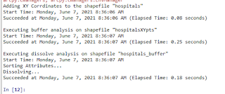
  1. Adds XY coordinates to the hospitals shapefile 
  2. Creates 1000m buffer around the hospitals 
  3. Dissolves the hospital buffers into a single-feature layer 
  4. Prints geoprocessing messages after each tool runs 

To begin and add the XY coordinates, I based the script completely off of the ESRI help link. 

arcpy.management.AddXY(in_features)

I know I had to add an overwrite component and used ‘arcpy.overwriteOutput = True’ line based on our practice exercise. To see the desired history method for each script I used the print (arcpy.GetMessages()) syntax I learned in the exercise as well. I also manually created a custom print statement, stating what tool was running before the GetMessages statement. 

Also going off of the practice exercise, I used the following for the buffer script:

Arcpy. Buffer_managment (‘file’ , ‘file path’  , ‘buffer distance’)

The last step was the trickiest for me, dissolving the buffered file as I got a bit lost in the syntax.

arcpy.management.Dissolve(in_features, out_feature_class, {dissolve_field}, {statistics_fields}, {multi_part}, {unsplit_lines})

I used the above script, utilizing BUFF_DIST as the dissolve field, leaving the stat field blank (“”), using single rather than multi_part, and lastly ‘DISSOLVE_lines’. 

n

Comments

Popular posts from this blog

Bivariate Choropleth and Proportional Symbols

In the first part of this lab, we used proportional symbols to represent positive and negative values in job increases/decreases in the USA.  Because there were negative values in this data set, I created a new map to "fix" the data. In this new map, I created a new field and copied the negative job loss data. I then used the Calculate field data and multiplied it by one to make it positive. Lastly, I overlaid both maps on the data and was able to accurately represent the increase and decrease of jobs in the USA by state.   In the second part of this lab, we delved into how to prepare data for a bivariate choropleth map, choose colors for the legend, and create a good layout.  I created three separate fields to analyze the data: Class Obese, Class Inactivity, and Class Final. I used the symbology tool to create 3 Quantile for the Obese and Inactivity classes and used each quantile to set the three classifications in the fields I created using the Select by Attributes tool to

Infographic's

 This week was a fun and challenging week as we learned about and created infographics. It was fun to create the infographics themselves, but challenging to figure out the best methods and practices in analyzing raw data.  We used 2018 County Health Rankings National Data from countyhealthrankings.org. I chose to move forward with the two values: Unhealthy Mental Days and Premature Dealth.  I   choose these two variables because those that struggle with mental health die before their time due to depression, anxiety, and/or a combination of similar issues. Both variables are normalized by relating their value to all counties within each state in the USA. For example, the poor mental health days is normalized as the average number of reported mentally unhealthy days per month per ctizen. The normalized premature rate is the “age-adjusted years of potential life lost rate per 100,000.”  Below, I created a scatterplot of the normalized data.  I choose to keep the scatterplot in a pretty tr

Color and Choropleths

This lab was very interesting as we dived into color theory.  In the first part of the lab, we created and compared linear and adjusted progression color ramps to themselves as well as a color ramp from the website colorbrewer.org.  I found, the colorbrewer color ramps are not as rhythmic when compared to the other methods, as they don’t step up at set intervals or rates. However, I don’t think that a set rate is needed to go from color to color. I preferred the colorbrewer ramp because each color was distinct from its neighbors. In the linear and adjusted color ramps, the colors looked too similar to each other and were not distinct enough for each step. I think that as long as the color ramp is moving in the opposite direction of the same color hue, the step rate or interval is not as relevant. When I first was completing the linear step I started with the purple hue option but had a difficult time, as each step in the color ramp looked the same. At one point, I created my own color